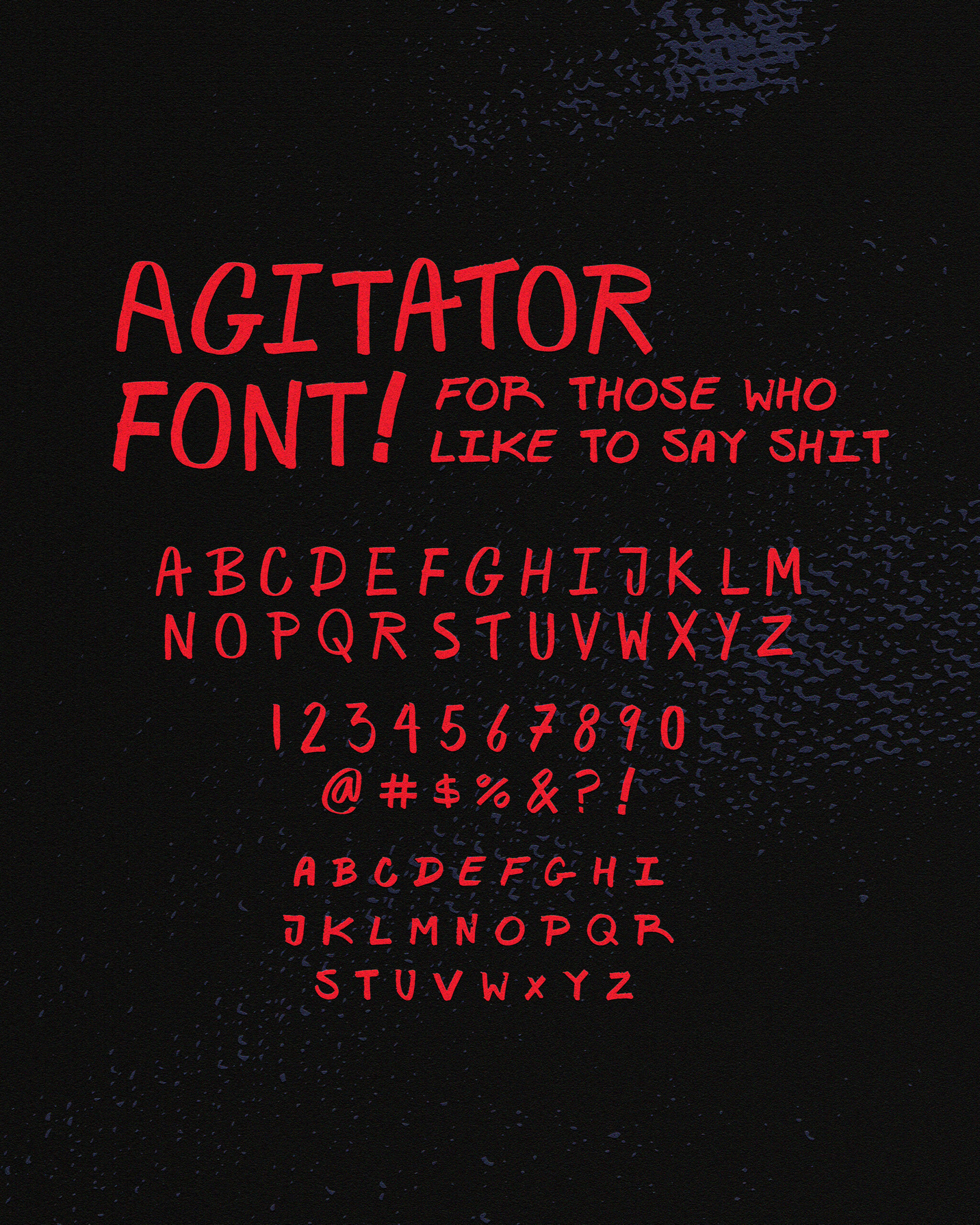
Agitator
Made to show the energy of protest and the urgency of handmade expression.
Process
Agitator was started by choosing the marker, a brush tip. With the marker selected, I started writing out multiple sheets of individual letters, experimenting to get a feel for the direction I wanted the font to head in. After filling out a sketchbook, I started writing out full sentences. This was important because it helped me understand how my handwritten letters connected with a more natural rhythm. Having a strong base of hand-drawn letters, I brought the sheets into Illustrator and used the image trace tool to vectorize them. However, in the first round, the glyphs didn’t look cohesive when placed together. To solve this, I developed a system, making sure each glyph used the same amount of space, creating better consistency across the set. For the small caps, I wrote out all 26 letters in sequence. With a solid set of glyphs ready, I imported everything into BirdFont. I replaced any glyphs that felt too inconsistent or out of sync with the overall feel of the typeface.